 So you just launched a new website. The site looks great, functions as it should and the whole company loves it. You’ve had great feedback from customers and the rumor is the board members are also impressed – all is good in the marketing department today. Good job! But just in case you have forgotten about the initial goals and objectives, here are 6 reminders why your new website is rock’n!
1. You have an amazing careers page
People are like gold and are your most important asset. This important section of your site should be shared with marketing and HR. The best career pages have videos that present some aspect of the company other than work. By attracting and hiring the right employees you will create a better company culture. You’ve given your employees purpose and a reason to get out of bed every morning to come to work. They are empowered to generate ideas and innovation is so thick it’s flowing from the water fountains. Your people are the key differentiator in a marketplace full of identical competitors™.
2. You write specifically for your customers
You’ve spent some time figuring out who your target market is and you’ve pegged three buyer personas that you have based all your content around. When potential visitors hit the site, they are drawn in and stay there. Low bounce rates baby!
 3. You’ve made it responsive
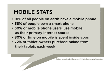
Since over 20% of all website are viewed on a smartphone or tablet and climbing – you’ve created a responsive website that allows users to see content on multiple devices. See some other interesting mobile more stats to the right.
4. Every page is optimized
The old adage goes, “unseen is unsold”. Every page is optimized and indexed by Google. Your keywords have really gained traction and are passing on important leads to your marketing team for qualification.
5. Every page is like flypaper
Every page on the site uses succinct phrases and larger type with big beautiful graphics. Graphics are easier to scan and easier to understand. Most people’s attention span is less than 10 seconds. You must get your point across quickly and engage your visitor and you’ve done that. There is also some videos that allow visitors to watch about your latest product feature.
6. Strong call-to-actions and lead nurturing
Every page has a CTR (Call to Action) and a mechanism in place to pass on quality leads to the sales team. You created the website in this way to reduce costs on lead generation because cultivating leads online can save your company money and make your sales funnel much more cost-effective.
Is your website still rocking?
Today, with so many aspects of digital marketing changing it’s somewhat impossible to keep up with best practices for web. Contact us today for a free consultation on your website and how to make it rock!


