Websites have changed a lot over the years. Websites were once solely used to give information about your company. But now websites are ground zero for businesses trying to grow their brand, generate revenue, attract employees, host content and much more.
However, too many businesses get their website wrong because they hire designers or agencies who aren’t very clear on how to communicate their brand’s message and who can’t optimize their site for maximum efficiency—especially in markets that are ultra-competitive and difficult to stand out in.
If you’re struggling to understand how to make your website more effective and need some help, you might want to pass this article on to your designer, agency or web manager to get things back on track.
 1. Clear header
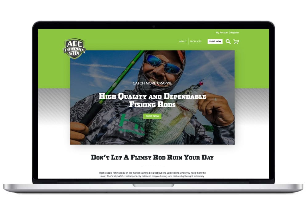
The very first thing your website should do when a visitor lands on your homepage or landing page—within 5 seconds—is tell your visitor what you offer in clear words.
I call this the “grunt test.” A caveman should be able to look at your header and grunt what it is you offer. If your website’s header doesn’t’ pass the grunt test – better go back to the drawing board.
Do it right:
In simple words, say what it is you do in 7 words or less. Add a small description underneath if you need to clarify further.
2. Don’t hide the cash register
To the ladies reading this post, what if a guy walks up to you at a bar and says, “hey, let’s get started!”
Your first response would be, “get started doing what?” Then you’d probably throw a drink in his face.
But how many times have you seen this call to action on a website? Call to actions must be crystal clear to be understood. Examples of a clear call to action:
- Buy Now
- Schedule a Call
- Book an Appointment
- Check Out
By not having a clear CTA on your website — you’re hiding the cash register. If people don’t know how to buy from you, how can you expect to make any money?
Do it right: “Don’t make me think” is an old mantra from 2003 on web design that is still applicable today. You must tell your prospects what you want them to do. Your call to action should be an up or down answer—that they either accept or reject.
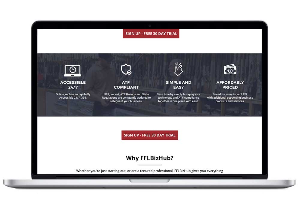 3. How will you help your customer be successful?
Value propositions can sometimes be confusing to understand. A value prop can be simply understood by asking yourself this question: What do I offer that will make my customer successful? Or asked another way: What are the 3-4 reasons my customer should do business with me? I get this question all the time because even in marketing—I also have my own set of competitors to deal with. Value propositions should also explain why your product or service works better than your competitors.
Do it right: Failing not to list the added benefits (or value) to your prospects/customers will make your website less effective.
4. What are the stakes?
On your website, tell your prospects what is at stake if they don’t work with you. You have to show them the future if they don’t act now to get their problem resolved. This can be as simple as writing a before or after or a with or without statement.
Do it right: Show your customers what the future will look like if they work with you.
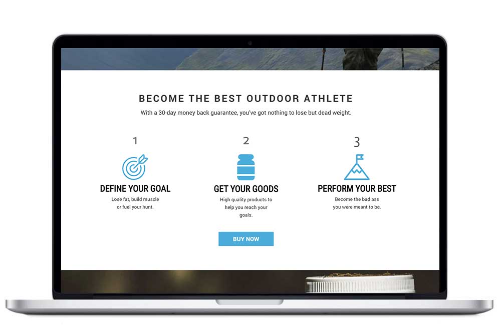 5. Give your prospect a plan
This section of your website should outline in 3-4 steps how to buy from you. This may seem counterintuitive but you need to explain it. The plan will help decrease the friction points and help them overcome any hesitancies they may have.
Do it right: Like stepping stones in a river, show your prospect how to get to the other side.
To sum up, make sure your header clearly tells what you do and passes the grunt test, add a clear call to action (no wishy-washy get started stuff) how you will help your customer achieve success, the stakes involved if they don’t work with you and the steps needed to get started. By adding these elements in your business, you will see an uptick in revenue.
CLEAR MESSAGING TASKLIST
Is your brand getting noticed?
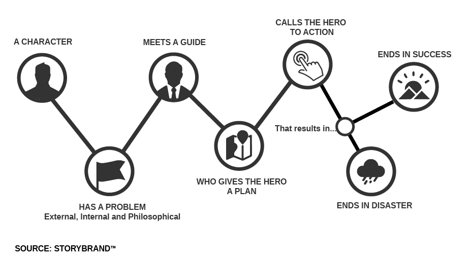
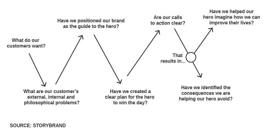
How much is unclear messaging costing you? The following tasklist will help you (the business leader, director or executive) in the outdoor, hunting, adventure or shooting sports industry determine if your message is clear. It will help you and your team think about how to make your customer “the hero,” and position your brand as the “the guide” that will revolutionize your marketing.
What you get:
- Introduction to a 7-part framework to clarify your message
- Know what to say and what order to say it in
- Give your team a messaging process that can be implemented across all your marketing materials


