Category

Web Design

We believe your website is the cornerstone of marketing communications. Garrison Everest has helped many of its clients grow their businesses through effective web design strategies by implementing custom websites that convey trust, credibility and targeted brand messaging.

4 Things Google Wants From Your Website In 2017

By Inbound Marketing, Web Design

Google is the most popular search engine on the planet with over 11 billion searches per month and controls over 67.5 percent of the U.S. search market (Source: DMR). Love ’em or hate ’em, Google dictates whether or not your web marketing efforts will be a success or a failure. 

If you’re a business owner or marketer thinking about how to get more out of your website—here are 3 (actually 4) things that Google wants that should be incorporated into your web marketing strategy.

1.Useful content
Google continues to make strides on ridding its Search Engine Results Pages, or SERPs of irrelevant content. 88% of consumers will search and consult on average 10.4 pieces of content before making a decision to buy. (Source: Google, Zero Moment of Truth). It’s no secret that creating content on a consistent basis is a sure-fire way to drive traffic to your website, and for good reason:

  • Companies that blog have 97% more inbound links
  • B2B marketers using blogs generate 67% more leads
  • Websites with blogs have 434% more indexed pages
  • Websites with blogs have 97% more indexed links

(Source: WPVirtuoso).

If you’re feeling a little behind, there is a reason to be concerned, because if you’re not blogging and creating useful content on a regular basis—your competitors (who are blogging)—are generating 54% more leads than you. If you’re not blogging, now may be the time to seriously consider it.

2. Clean design
The web has evolved over the years from cluttered jam-packed home pages to clean pages where less is more. Your website needs to get to the point quickly as you only have 2-3 seconds to get your point across. Eyequant states that websites looking to decrease bounce rates and increase longer visitor times should adhere to these three precepts:

  1. Make your most important information the most attention-grabbing
  2. De-clutter unnecessary elements on your page
  3. Simplify: give users one task, not dozens

By following these guidelines, you’ll be able to maximize your website’s performance for increased visitor lengths. 

TIP: To test your website’s most important information use CrazyEgg: https://www.crazyegg.com

3. Fast load times
The web is a fast, get-in, get-out kind of media. You essentially have 3 seconds to capture the attention of your viewer or they leave (bounce) without saying goodbye. Websites should focus on load times between 2-3 seconds on a broadband connection.

TIP: To test the speed of your website, check out website.grader.com

google ranks for mobile5 things that slow your website down:

  1. Large images
  2. Excess javascript code
  3. Flash and embedded videos
  4. Non-utilized or useless CSS code
  5. Embedded third-party plugins like Twitter and Facebook feeds

By optimizing the above factors, you can increase your website’s load times and potentially increase your ranking on Google.

4. Mobile-friendliness!
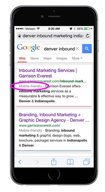
Google announced starting April 21st, 2015—your website’s mobile-friendliness will now be a ranking factor. (Source: SEMPOST) This means if your website is not responsive and mobile friendly, you will lose out on potential ranking factors. To find out if your website is mobile-friendly, simply go to your iPhone and search for your company. If your site is mobile-friendly, it will say it under the green URL “Mobile-friendly.” To read more about responsive, mobile-friendly design, check this article out. 

So to sum up, in order to play in Google’s arena, you need to create useful, content consistently, have a clean design, make sure your website loads quickly and is mobile friendly!


Brand Development Inbound Marketing Consultant

By Josh Claflin, Brand Development, Inbound Marketing & Creative Strategy
Josh helps brands in the hunting, outdoor and firearms industry who are struggling to develop their brand; grow, stabilize or increase profits through their websites; increase revenue through online channels and enter the digital era of marketing.

10 Secrets to better home page design

10 Secrets To Better Home Page Design

By Web Design

With only 3-5 seconds to capture your website visitor’s attention, your company’s home page is one of your most important pieces of brand real estate.

If you’re a business owner (or marketer), knowing the secrets to effective home page design is critical to success in the realm of inbound marketing. In this article, I’ll give you the recipe that will help you design a better home page that will decrease your bounce rates, improve customer conversions and improve your brand’s digital impression. 

To begin, there are 5 overarching secrets to building a better home page.

1. Cognitive fluency
home page web designCognitive fluency is simply a measure of how easy it is to think about something, and it turns out that people prefer things that are easy to think about to those that are hard.

Google researchers found that users judge a website as “beautiful” within 1/50th – 1/20th of a second. “Visually complex” websites are consistently rated as “less than beautiful” as their simpler counterparts.

Let me an illustrate an example. Have you ever gone on a blind date?

As soon as you open the door — you’re able to within 1/50th of a second determine if the person standing before you is attractive or not. 

Websites work a lot like a blind date. You punch in a keyword not knowing what to expect until the page loads—and when the page finally loads—you either bounce away in horror or you pleasantly choose to stay—gazing at the beautiful layout in front of you. 

When designing your home page, simple = beautiful. 

2. Simple navigation
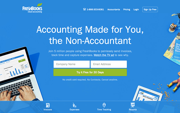
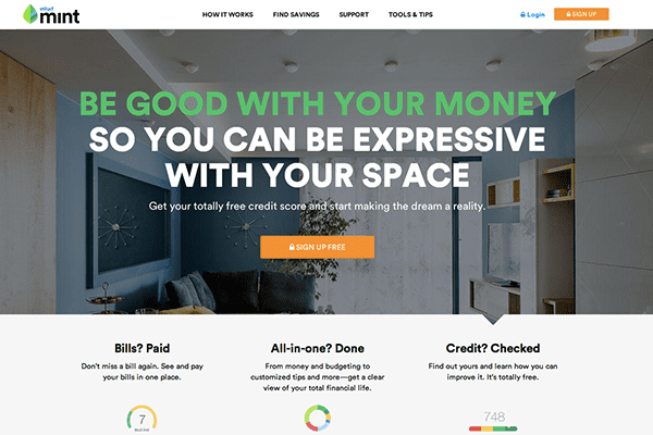
Simple navigation keeps the home page clean and gets your visitor to where they want to go quickly. Try to keep your navigation to an absolute minimum. Design your website’s architecture in a way that doesn’t detract from your overall goal. Notice the examples in this article. The examples shown have 3-5 navigation topics max.

Website Homepage Design3. Relevant color scheme
Keep your colors appropriate and in context to your industry. Do you need a dark color palette to convey luxury—or a more lighthearted palette to show approachability? Know what colors are used in your industry for maximum appeal. Find out more about your buyer persona to get an understanding of what will resonate with your target audience.

4. Streamlined next steps
What do you want your customer to do when they are on your website? Download an ebook? Contact you? Map out what you want them to do next. Don’t leave your visitor hanging. Think for them and move them through the buyer awareness stage using strong call to actions (CTA’s).

Now that you know the 5 overarching factors for a successful home page design, now you need to know the 5 elements and how they are implemented.

5. Logo

Your logo design serves as the anchor point for your website and communicates your company’s credibility and trust. Eye patterns start from top left and go down toward the right. An interesting and professional logo makes a great first impression. 

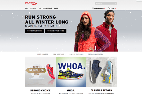
Website-Homepage-Design-Saucony6. Main image = main message

Next is your main image with the main idea that you want to communicate. Your message should be short and succinct. Be clear, not clever. Your imagery should position your brand accordingly and be tied to your main message. The image should be creative and eye catching. This is your chance to “stick” your visitor to your site. If someone hits your site and immediately bounces off, it’s because your message was not clear and they found your site unexciting or irrelevant.

7. Service offerings

Scrolling down—you should now tell your visitors what you offer and how you can help them. Make sure the text is written for them. By accurately defining your buyer persona, you’ll be able to talk their language in a way that grabs their attention and presents the impression that you understand them. This works in your favor to convince them you’re the company for the job.

8. Why work with you?
Next, you want to present the reasons why someone would want to work with you. These should be the top 3-4 things that separate you from your competitors and distinguish your brand. Make the reasons compelling enough and link to the areas of your website for more information and to track engagement.


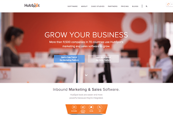
Website-Homepage-Design-Hubspot9. Social proof
People tend to follow people. By showing social proof that people like you on Facebook or follow you on Twitter can lend real validity to your above claims. If possible, showcase real customer testimonials with faces. This is the icing on the cake for presenting a credible narrative by showing others who you’ve helped.

10. Load time & responsiveness
Users want sites that load fast and that are responsive (iPad, iPhone and Desktop). By keeping your content simple and optimizing your images correctly you can decrease load times. If you’ve hired a web design company to build your site—ask them about load times and if they use content distribution networks (CDN), browser caching and if they will minify javascript and CSS for a faster loading home page. Below are some interesting stats on load times according to MOZ.

  • If your site loads in 5 seconds it is faster than approximately 25% of the web
  • If your site loads in 2.9 seconds it is faster than approximately 50% of the web
  • If your site loads in 1.7 seconds it is faster than approximately 75% of the web
  • If your site loads in 0.8 seconds it is faster than approximately 94% of the web

See how your website stacks up at: Pingdom

In conclusion, knowing the secrets for better home page design will ensure lower bounce rates and attention grabbing messaging you need to move your customer further down your sales funnel for customer conversion. These factors when taken into account will turn your website into a revenue generating machine.


Professional web design

Can Your Website Do These 5 Things?

By Web Design

Perhaps one of the biggest mistakes most marketers and business owners make is that they overlook their website’s true potential. We know that a website is a necessity to do business. We know how our site should function and what kind of information it needs to contain. But a lot of times we don’t quite grasp the importance of how—that with a few changes—our company’s website could be modified to work harder for our businesses.

Below are 5 things you didn’t know your website could do. More than a pretty face —your website has much more potential than you think.

1. Make you look bigger than you are
If you’re a smaller business looking to attract big clients, your website is the first step. In today’s digital world, impression and trust is everything. A website can communicate your brand’s unique message and connect with your prospect. Microsoft Research reports that people spend only 10 seconds on your homepage before leaving if they don’t immediately connect with your marketing messages. With the aid of professional website design and targeted and clear messaging, you can present your company as a reliable, professional partner that keeps your visitors on your website longer.   

2. Generate revenue

Through methods like blogging, social media, CTA’s (call-to-actions), premium offers and landing pages you can essentially create a completely new revenue channel to grow your business. This process, termed “inbound marketing” is a method that attracts, converts, closes and delights customers to grow your business online. This methodology is proven in the digital age and can significantly affect your bottom line. Consider these following statistics:

  • According to Social Media B2B, B2B companies that blog generate 67% more leads per month than those that don’t.
  • The Content Marketing Institute reports that 8 out of 10 people identify themselves as blog readers, and 23% of all time spent online is spent on social media sites.
  • ContentPlus published that blogs give websites 434% more indexed pages and 97% more indexed links.
  •  Search Engine Land shares that up to 80% of people ignore Google-sponsored ads.
  • HubSpot’s research shows that 75% of users never scroll past the first page of search results.
  

These trends show that one way to grow or market your business more effectively is by utilizing an inbound methodology as a way to increase traffic, leads and convert visitors to customers. When these mechanisms are in place, and given time to work— your website turns into a 24/7 lead generator.

3. Build your brand
With the right content marketing tactics, you also can build your brand locally and nationally quicker than traditional advertising and marketing methods. Unless you have 20 million for a national ad campaign to spend, inbound marketing costs 62% less per lead than traditional marketing. 54% more leads are generated by inbound than outbound or traditional advertising and marketing methods. If you are able to generate relevant content that solves your customer problems—and do that consistently, your brand will begin to take root in the minds of your customers.

4. Attract talent
90% of all online applicants will visit a company’s careers page. Data suggests that just because you have a strong corporate brand, doesn’t necessarily mean it translates into a strong employer brand. Websites that have a video that showcases their company’s values and culture will receive more applicants than a company who doesn’t. (SOURCE: LinkedIn Employer Handbook. December 1, 2012) With a strong careers page, your chances of attracting top-tier talent increases.

5. Connect your brand to your customer
Having a professional website design created with your customer or buyer persona in mind can allow you to connect your brand to your customer more effectively than traditional push marketing can. By utilizing your website as the cornerstone in your social media activities you can drive traffic from social networking sites like Facebook, Google+, Twitter and Pinterest that connects your brand to your customers that creates real affinity and preference.  

In conclusion, your website may not be able to cure world hunger or create peace in the middle east, but it can make you look bigger than you are, generate revenue, build your brand, attract talent and connect your brand to your customer. By adopting an inbound marketing methodology, you can turn your website into revenue generating machine and a valuable and effective marketing tool.

If you need help or have questions on how to make your website work harder for you, please contact us.

How Much Does A Website Cost

How Much Does A Website Cost?

By Web Design

I started my first HTML page back in college in 1997 before the internet was ‘thee internet.’  Since then, I’ve architected and built sites for start-ups to public-traded companies with hundreds of thousands of users and yet even in 2014 the question of cost is a tricky one.

    
Here’s why…

Today, I think it’s a fair assumption that most people view websites as a commodity. Due to recent hard economic conditions—that seems to be letting up—small business owners and start-ups can’t afford to spend big money on a website which they see as just ‘a website’. With the bad economy brought the emergence of crowdsourcing and discount website building companies. Websites now have a terrific low barrier of entry—with little differentiation in how they function which has brought the perception of their value down.

Savvy companies and brands know that their website is an invaluable marketing and sales tool that allows them to achieve their sales and marketing goals. It supports their marketing and sales efforts and provides assurance to their customers and employees in the form of innate trust. Through social media, content, video and imagery, modern companies understand that the look and feel of a website is just the first step in a broader strategy.

Below I’ve compiled 4 things to help you understand how and why a website is priced and what separates the free websites or discounted website builders from a true marketing tool that transforms your business.

1. Start with your goals
When we start with a new client the first thing we ask is: “What are your goals?” Is your goal just to have a great looking site with great pictures and products and photography or do you really want it to be more than a pretty face? Today, having a website is just the first step. That free website you started and launched a few months ago isn’t enough to build a business or a steady stream of revenue in today’s digital landscape. Businesses must adhere to a specific set of standards, rules and best practices if they hope to ever be found online according to Google’s recent algorithm changes. If you can’t get found, then what’s the point of having a website? Sure, you can have it on your business card and point your customers/clients to it, but in today’s competitive environment is that enough?

If your goals are to increase traffic, there are ways to do that through blogging, social media and search engine optimization. If you want to generate leads, there is a process that creates offers your visitors can’t resist; offers so good that they will gladly trade their contact information for your offer that allows you to continue the conversation. If your goal is customer acquisition, there are methods through things like workflows and lead nurturing that can be utilized to move a potential buyer further down the sales funnel to the close stage. All of this begins with your goals. Design and functionality should be built around your goals and not a cookie-cutter, one-size-fits-all solution.

Bottom line:

  • Research
  • Traffic generation

  • Lead generation

  • Customer acquisition
  • Search engine optimization
  • Content creation
  • Social media management
  • ROI analysis and reporting
    COST = $500 – $15,000/mo. (depending on how fast you want to achieve your goals)

2. Build a solid foundation
Once your goals are set and we know what kind of website you want to build we start with building a strong foundation. There are numerous platforms and applications out there to build a website. You can even start with a blank html page and start building one from scratch. Each are different and come with a set of standard features and functions. Names like Drupal, WordPress, Joomla and Expression Engine come to mind. We use an open source platform called WordPress. WordPress comes with a basic content management system and thousands of free plugins that function like apps on your iPhone. Plugins add extra functionality to a WordPress site like spam blockers, newsletter signup forms, contact forms, maps, buttons, sliders, Facebook feeds and more. It’s also one of the easiest platforms out there for our clients to use—which is why we use it—and it’s for a great price (FREE!). Hosting is also quite cheap to come by. We host with Rackspace Cloud that provides our clients with a cost–effective hosting solution backed by Rackspace’s fanatical support guarantee.   

Bottom line:

  • WordPress: FREE
  • Hosting: $4.99 – $14.99/mo.
  • Domain: $9.99
  • Premium domains: $50+
    COST =$4.99 – $100

3. Design, integrate and optimize to get found
You can go out and by a theme for WordPress for around $40. However just plugging in a theme assures your website will look like a thousand other websites out there. We offer two cost-effective options that take a theme as a base design and modify or “skin it”. “Skinning”
 means taking a native theme design and customizing it to your brand’s unique look and feel. This way the theme takes on a completely different look while customized to your specifications. If you were to build a website from scratch, or through a base code program like Bootstrap the costs would top into the tens of thousands. Fortunately today, small businesses have the option to start with a theme and modify it to match their desired look and feel for a reasonable price.

Additional design costs begin to incur in the form of content. Content can be anything from written text, custom graphics, buttons, background patterns and more. All these add to the time and effort the team must put into the project. You may need diagrams, a video, or downloadable collateral to help customers understand complex products or services. All of this will need to be taken into account.

Then comes photography. No one EVER wants to invest in photography—which is a shame. You basically have the choice of buying quality images or low-quality images. High-end stock photo sites like Getty and Corbis start at $250+ each. Mid-grade sites like Veer and Jupiter start around $50+; and low-quality sites like Shutterstock and iStock prices start at $5+. However the quality shows. Cheap images don’t add visual value to your website and they look cheesy. Most visitors will pick up on this and leave and forget your site ever existed. Photography is always a huge line item in any web project. So be prepared to invest to make your site look polished.

At the end of a professional webdesign design process you also will need to optimize the site for your keywords. Search engine optimization consists of having relevant title tags, descriptions, image alt tags, on-page links and inbound links all based on the keywords someone would punch in to find you. Google accounts for almost 90% of all search traffic so everything is typically geared toward their requirements.

Bottom line:

  • Theme = $40
  • Customizing (Skinning) = $1,500-$2,000
  • Custom graphics = $800-$1,200
  • Photography = $500
  • Good photography = $1,000
  • Search engine optimization = $400
  • Content creation (provided by web company): $1,500-$2,000
    COST = $40 – $10,000

4. Have a back-up plan
After the site is launched the site isn’t over. Websites should not be viewed as a “one and done”. Now you have to factor in the possibility of any malicious attacks, customer service problems, billing errors etc. that add to the costs of maintaining the site. Most sites can go for years without any major issues, but you will need to keep someone on hand who can address any required updates and any other issues if they arise. The old saying: Anything that can go wrong will go wrong —is true. I can’t tell you how many times we’ve had clients going into a meeting and their website goes down.

Bottom line:

  • COST = $0-$1,000/yr.

To wrap up, pricing a professional website is a very difficult thing to do. As a small business you are trying to cut costs and do things right. You have to start with your goals and work backwards on what you have to spend.  Only by setting goals that are SMART: specific, measurable, attainable, realistic and timely can you accurately quantify ROI and what a realistic investment is.

Responsive Web Design

5 Best Practices for Responsive Website Design

By Responsive Web Design, Web Design

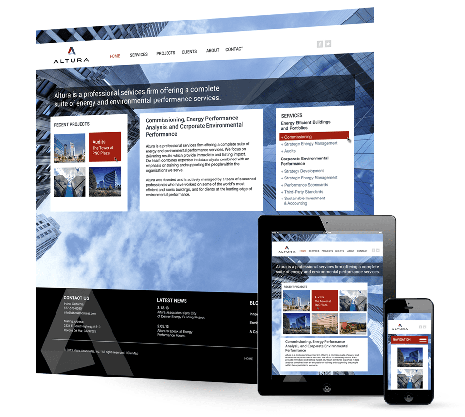
If I had to guess, I would estimate that over half of all U.S. businesses have yet to change their website to a responsive web design format (viewable on smart phone, tablet and desktop).

What most brands don’t know is that 50% of mobile phone users, use mobile as their primary internet source. This statistic will only continue to grow in the years to come. If your business has not made the move to a responsive website design format yet, here are a few best practices and things to keep in mind when you do.

What is Responsive Design?

Responsive means that it fits on three screens: mobile, tablet and desktop. Responsive web design is accomplished by CSS (Cascading Style Sheets). CSS is what developers use to design a webpage. From a marketer’s perspective it’s like a branding guide for your website. It tells the browser how to interpret the HTML that contains the CSS. Why does this matter? It means that if creating a mobile-specific website or app is out of budget — you can still deliver a great experience through responsive design.   

Here are a few key statistics you should know:

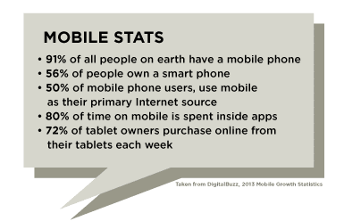
  • 91% of all people on earth have a mobile phone
  • 56% of people own a smart phone
  • 80% of time on mobile is spent inside apps
  • 72% of tablet owners purchase online from their tablets each week
  • 50% of mobile phone users, use mobile as their primary Internet source

1. Start with Your Brand

Before any coding takes place — start with your brand. As more and more competition enters the marketplace (domestic and global) it seems darn near impossible to stand out. Having clear brand differentiation in the marketplace will be one of the main ways to attract customers, close leads and delight customers.  When people hit your website, the first impression must reflect your brand’s persona, message and promise to the customer. Your brand must answer these four questions: Who are you? Who needs to know? How will they find you? Why should they care? Read more about brand development here.

2. Create Buyer Personas

Once you have your brand tuned up — begin by creating an architecture based on who your ideal customers are. Get really granular on who they are and write your content for them specifically based on these key points:

  1. How does my product or service solve my customer’s problems?
  2. What can I do to add value to their visit?
  3. How does my brand align with their personalities and expectations?
  4. What is the tone and voice I must take to communicate clearly to them?

By basing your content on your buyer persona your content will keep them engaged and add value. Wrap this content around a clear and intuitive navigation to help them find the information quickly. The old rule in website design: “Don’t make me think.” still rings true today.

3. Content Strategy and Perception

Your brand must provide a credible and authentic impression to your visitors. Today, people want more visuals and less text on the home page and secondary pages. Communicate your offering simply and effectively.  With 60% of the sales cycle over before a visitor even contacts your sales person — your website must engage your visitors and make the sale for you.  According to Google’s Zero Moment of Truth study, consumers consult an average of 10.4 pieces of content prior to making purchase decision. Make your content count.

4. Optimizing for Search Engines

To be indexed by Google, Yahoo! and Bing — use the following criteria to create your page structure:

  1. Accurate keyword titles and descriptions
    Use the Google Trends tool or MOZ to target the right keywords.
  2. Fast loading pages
    Optimize your images and use CSS to speed your site’s visual elements. Your website must load less than 2 seconds or people will abandon your site.
  3. A flow of fresh and relevant content via blog
    77% of all Internet users read blogs. By blogging on a regular basis you will receive 55% more website visitors. By creating interesting content, you increase your chances of getting back links from other credible websites which passes on “link juice” to your site, increasing your rankings. You also will have your content tweeted, shared or liked.
  4. Low bounce rates
    If you’ve done the above 3 points, you should see lower bounce rates. 50% or less is excellent, 60-70% is typical, 70-80% is poor, 80%+ is very bad. When Google sees sites with high bounce rates, it typically means the site loads slow, is a spam site or the keywords are not representative to what the site is about.
  5. Social proof
    If you haven’t embraced Facebook, Twitter, LinkedIn or Google+ now is the time. Consider the following shocking statistics:
  • 4.2 billion people use their mobile device to access social media sites
  • The population of the United States is 313M
    • There are 245M internet users in the United States
    • 56% of Americans have a profile on a social networking site
    • 166M or 52.9% of all internet users are on Facebook
    • 47% say Facebook has the greatest impact on purchase behavior
    • 54% of Facebook members have used the social network via a phone
    • 22% of Americans use social networking sites several times per day
    • Facebook is the most addicting of the social networks
    • 76% of Twitter users now post status updates

By adding social proof to your site you humanize your brand and allow your users to share its content far and wide.

Professional Responsive Web Design Company5. Design for Responsiveness

Now that you have some directions on how to go about planning your responsive website design here are a few things to keep in mind when design and coding time comes.

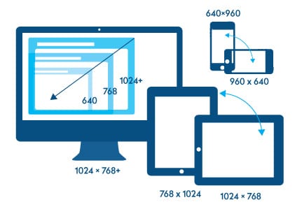
The screen size is the diagonal measurement of the physical screen in inches, while the resolution is the number of pixels on the screen. The resolution is displayed as width by height (i.e., 1024×768). Also, while desktop and laptop displays are in landscape (wider than tall), many mobile devices can be rotated to show websites in both landscape and portrait (taller than wide) orientations. This means that designers and developers, in some cases, must design for these differences. Make sure to design each view to see the differences in each and adjust accordingly:

  • Your website accomplishes responsiveness by scaling the images and text by percentages of the screen instead of fixed widths
  • Create 10px margins on each side so that the design doesn’t look crowded
  • web designImages should fill the whole screen and scroll evenly down the screen
  • Remove any non-essential content
  • Watch for breakpoints. As the site scales, make sure the screen adjusts at  the right resolution to keep the design and layout in tact
  • Allow compression of your scripts and CSS to make the site load faster on mobile devices that are often on a 3G or low-speed connections
  • Create an Apple touch icon (129 x 129) so people can save to their home screen
  • Most people prefer landscape (59.8%) over portrait (41.2%) (Source: Apple Insider)

Google announced starting April 21st, 2015—your website’s mobile-friendliness will now be a ranking factor. (Source: SEMPOST) This means if your website is not responsive and mobile friendly, you will loose out on potential ranking factors. Find out if your website is mobile-friendly.

  • Desktops & laptops 1024×768 and higher
  • iPhone 5: 1136×640 4S: 640×960 3GS: 320×480
  • iPad First & second generations: 1024×768
    Third generation: 2048×1536
  • iPad mini 1024×768

Android phones & tablets
Most phones are 320px wide or 360px wide, and most tablets are 800px wide. When designing for them, however, it is typical for developers to break them into the following groups based on their Density-independent pixel (dp), which is the minimum screen size.

  • Small screens: 426dp x 320dp
  • Normal screens: 470dp x 320dp
  • Large screens: 640dp x 480dp
  • Extra-large screens: 960dp x 720dp

In conclusion, by making your site responsive, you now have the ability to tap into mobile traffic that you otherwise were missing out on. As companies like Google, Apple and Microsoft continue to innovate new devices — businesses will need to keep up to speed on the latest trends to ensure they are maximizing their online potential.  

6 Reminders Why (or why not) Your Website Rocks

By Web Design

shutterstock_11682370So you just launched a new website. The site looks great, functions as it should and the whole company loves it. You’ve had great feedback from customers and the rumor is the board members are also impressed – all is good in the marketing department today. Good job! But just in case you have forgotten about the initial goals and objectives, here are 6 reminders why your new website is rock’n!

1. You have an amazing careers page
People are like gold and are your most important asset. This important section of your site should be shared with marketing and HR. The best career pages have videos that present some aspect of the company other than work. By attracting and hiring the right employees you will create a better company culture. You’ve given your employees purpose and a reason to get out of bed every morning to come to work. They are empowered to generate ideas and innovation is so thick it’s flowing from the water fountains. Your people are the key differentiator in a marketplace full of identical competitors™.

2. You write specifically for your customers
You’ve spent some time figuring out who your target market is and you’ve pegged three buyer personas that you have based all your content around. When potential visitors hit the site, they are drawn in and stay there. Low bounce rates baby!

MOBILESTATS3. You’ve made it responsive
Since over 20% of all website are viewed on a  smartphone or tablet  and climbing – you’ve created a responsive website that allows users to see content on multiple devices. See some other interesting mobile more stats to the right.

4. Every page is optimized
The old adage goes, “unseen is unsold”.  Every page is optimized and indexed by Google. Your keywords have really gained traction and are passing on important leads to your marketing team for qualification.

5. Every page is like flypaper
Every page on the site uses succinct phrases and larger type with big beautiful graphics. Graphics are easier to scan and easier to understand. Most people’s attention span is less than 10 seconds. You must get your point across quickly and engage your visitor and you’ve done that. There is also some videos that allow visitors to watch about your latest product feature.

6. Strong call-to-actions and lead nurturing
Every page has a CTR (Call to Action) and a mechanism in place to pass on quality leads to the sales team. You created the website in this way to reduce costs on lead generation because cultivating leads online can save your company money and make your sales funnel much more cost-effective.

Is your website still rocking?

Today, with so many aspects of digital marketing changing it’s somewhat impossible to keep up with best practices for web. Contact us today for a free consultation on your website and how to make it rock!


How to Revive a Dead Website

How to Revive a Dead Website

By Web Design

Revive a Dead Website

So you started a website project a few years ago and it has basically been left to drift and DIE!  Somehow you got really busy and the dreams of starting your new internet venture got put on the back burner.  It wasn’t your fault… job, kids, life got in the way.  But now, you’re ready to get back on it – fully motivated and ready to rock. Have no fear, here is list of things you can do to revive that old website and get it back on track, or until you can afford a new one.

Ask yourself these questions to evaluate where you are and where you need to go:

Website Design & Branding:

  1. Is the current branding look/feel in line with the audience you were targeting years ago?  If  not, make some changes.  Update your tagline, maybe change your logo to a new font face, update the colors, etc.
  2. Is the imagery looking a bit nostalgic?  Replace those pics with people who live in this era.
  3. Content – does it look busy?  Is the functionality outdated?  These types of issues usually deter savvy internet users from staying on your site.  Make it super easy to understand.  You only have about 8 seconds to capture their attention.
  4. More pictures, more content, more action!  Add some JQuery sliders or an animation.
  5. If you made the brand about you, make sure you evaluate your strengths and weaknesses.  People will tend to heavily gravitate or heavily repel from personal brands based on how they see and/or relate to you.  This will also effect your ability to effectively target your audience.
  6. Make it mobile-friendly! Your website must work on all devices. 

Content & Community:

  1. For subject enthusiast sites (hobbies, interests, sports, politics, etc.) to be successful, you need to be blogging 2-3x per week – yes, that’s a lot.  No one said it would easy.  To supercharge it, add 2 or 3 videos monthly or more and make sure the photography and content is interesting and adds value.
  2. Imagery needs to be rich and interesting.  This causes the site to be “sticky” – meaning when people hit it they stick around.
  3. Inbound marketing or “pull” marketing is the name of the game.  Blogs or articles should add value to your subscribers and visitors.  Earn their trust, help them solve problems, make them feel a part of something bigger, provide useful information — build your credibility.
  4. You need to think in terms of how you can build a community or “tribe” where you earn the trust of people who have the same likes/dislike as you.  I have two clients who are really successful at this.
  5. Client 1 on average sees over 6k visits per day and Client 2 has a community of over 85,000 people and has over 10k visits per day. They both built a community that supports their users.  In your case, you need to be the catalyst to help your visitors come together.  You may seem to have the right topics, but you must also be willing to let things go completely organic and be as authentic as possible.  In a media saturated world, authenticity is better.
  6. Both clients direct their efforts toward other online groups, email marketing, merchandise, events and online radio shows.  Checkout blogtalkradio.com.
  7. Social Media – Once you’ve got some relevant content going, time to start reaching out and joining the conversation on other blogs, Facebook pages and following like-minded people on Twitter and connecting on LinkedIn.  Build a following by commenting and jumping in on conversations.  The great thing about the web is you don’t need an introduction, just something in common — so jump in and start making friends.
  8. Already thinking along these lines?  Good…now you need SEO to ignite it.

SEO & Marketing:

  1. Your site most likely needs to be optimized.  Since it’s been dead for months (or years), it lacks a lot of the keywords necessary for page rankings.
  2. To accomplish this, you need to hire a professional SEO firm to help you get it optimized.
  3. Google just put out a new algorithm – the programs that rank websites – and their requirements are stricter than ever.  The new algorithms are now based on sites that provide real substance and real human opinion.  Gone are the days where links were enough.
  4. Site speed – very important, make sure your site loads quickly.

By keeping these points in mind, you’ll be ready to shock your website back to life!